Highlight block container
Highlight block container comes from the extended syntax of Markdown :::, for example
::: warning
This is a warning.
:::
The display content is as follows:
This is a warning.
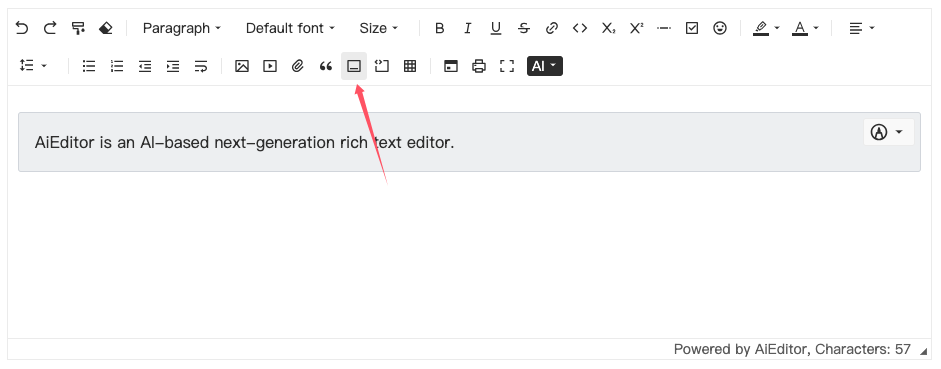
In AIEditor, we can directly input :::warning and then press Enter to add a highlight block container. Or we can add it by clicking the toolbar button, as shown below:

In AIEditor, there are three built-in highlight block containers: info, warning, and danger.
Default highlight block configuration
Default highlight block configuration is the type of highlight block used when clicking the highlight block icon in the toolbar. Or when the user only enters ::: and then presses the Enter key, the default type is used.
new AiEditor({
    element: "#aiEditor",
    container: {
        defaultName: "warning",
    }
})
The default setting is to use the "warning" type.
Custom highlight block container
Users can make more configurations through the following code:
new AiEditor({
    element: "#aiEditor",
    container: {
        typeItems: [ "default", 'info','warning','danger',]
    },
})
In the above code, 4 types of highlight blocks are configured, namely default, info, warning, and danger. At this time, we enter :::default and then press Enter to add a highlight block of the default type.
In the above code, although we have added the "default" type, this type will not have any style. We also need to add the following css code externally:
/* The “default” in the following “div.default” is the name we added*/
.aie-container div.default{
    background: #fafafa;
}
Or, define different colors in dark and light themes:
.aie-theme-light {
    --my-default-color: #fafafa;
}

.aie-theme-dark {
    --my-default-color: #333;
}

.aie-container div.default{
    background: var(--my-default-color);
}
Other things
When using the aieditor.getMarkdown() method to get Markdown content, AIEditor will automatically convert the highlighted block to Markdown syntax.
For example:
::: warning
This is a warning.
:::